








ContactPress & brand
Our name, in your hands.
Logo files, colours, type, pictures and words, with the few rules that keep them right. Writing about us, designing with us or putting our name next to yours? Start here. The press desk is one message away.

01The logo
One mark, two files.
The monogram sits above the name, and the two always travel together. There are two files: black for light grounds, white for dark grounds and photographs. Put them on the bench and see what holds up.

Drag it, or use the arrow keys to move it. Hold Shift to move further.
Minimum 40 px. From 96 px the whole name reads comfortably.
Good to go.
- Contrast
- 21.0:1 against the ground
- Size
- Comfortable
- Space
- Clear space kept
Clear space
Keep at least x clear on every side. x is the height of the letters in WATFORD, so the space grows and shrinks with the logo.
Minimum size
40 px wide on screen and 11 mm in print. From 96 px, or 25 mm, the whole name reads comfortably.
Files
Black and white SVG files of the complete logo. Ask the press desk for them rather than copying the logo from a web page.
02Do and don’t
Treat it like a finished surface.
The logo is drawn once and used as it is: no stretching, no effects, no retyping. Every mistake below comes with its fix. Press it and watch the logo recover.
-
Do
Black on white
The everyday logo: the black file on White or Mist.
-
Do
White on black
The white file for dark pages, films and night scenes.
-
Do
White on a calm picture
Over a quiet part of the photograph, with a soft scrim behind it.
-
Do
Room to breathe
Clear space of at least x on every side, even in tight layouts.
-
Don’t
Stretch it
Scale it evenly, or not at all.
-
Don’t
Tilt it
It always sits level, on its own baseline.
-
Don’t
Add effects
No shadows, glows, outlines or bevels.
-
Don’t
Fade it
No tints or transparency: black or white, at full strength.
-
Don’t
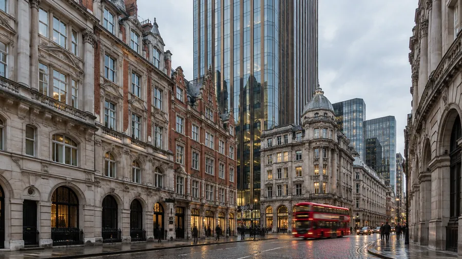
Lose it in a busy picture
Find a calm area, or add a scrim.
-
Don’t
Crowd it
Keep headlines, edges and other logos outside the clear space.
-
Don’t
Retype it
The name is drawn, not typed. Always use the file.
-
Don’t
Put black on black
On dark grounds, switch to the white file.
03Colour
Ink and paper.
Our colours are black and white, with a short family of greys for text and lines. Colour itself comes from photography: daylight, timber, sky and stone.
Selected colour
Ink
The logo, headlines on white and dark pages.
- HEX
#000000- RGB
rgb(0 0 0)- HSL
hsl(0 0% 0%)- CSS
--wc-ink: #000000;
Try a pairing
Our name, in your hands.
Body text at 17 px: logo files, colours, type, pictures and words.
17.4:1
- Body text, AA4.5:1
- Large text, AA3:1
- Body text, AAA7:1
Every pairing, woven.
Rows are text, columns are grounds, and every square is the real pairing. 7:1 or more 4.5:1 or more 3:1, large text only under 3:1
On light pages
Text is Graphite or Ink. Muted text goes no lighter than Steel.
On dark pages
Text is Mist. Muted text goes no darker than Pewter.
Lines
Hairlines of black or white at 12 to 16 per cent, never a heavy rule.
No accent colour
States are shown by shape, weight and fill, so nothing depends on seeing colour.
04Type
Set in the system.
We don’t ask anyone to install a font. Our pages use each device’s own system typeface: tight and confident in headlines, open and calm in text, and instant to load.
On this device you are reading the system typeface.
Headlines are written in sentence case.
Semibold 600 · 96 px · letter spacing −0.045em · line height 1.02
-
Our name, in your hands.
-
Ink and paper.
-
Talk to the press desk
-
Logo files, colours, type, pictures and words, with the few rules that keep them right.
-
Body text is set at 17 pixels with generous line spacing, so long paragraphs stay easy to read on a phone or a large screen.
-
Concept visualisation · a tower at dawn
-
Sheet 04 · Type
Sentence case
Headlines read like sentences. Capitals are kept for short labels.
British English
Colour, aluminium, centre, organisation, programme.
Tight only when big
Close letter spacing belongs to display sizes. Text keeps its natural spacing.
Monospace for data
Labels, measurements and values. Never whole sentences, and never under 11 px.
05Photography
Pictures with the light left in.
Our pictures show buildings and homes in natural light, materials up close and people at ease. They are concept visualisations, and we always say so.
Natural light
Dawn, daylight, dusk and night. The hour sets the mood, with no added colour casts or filters.
Architecture first
The building, the door, the detail. People belong in the scene, not in front of it.
At a natural distance
People are seen at ease, doing what they would do anyway. Nobody poses for the camera.
Honest captions
Every scene is captioned “Concept visualisation”, wherever it appears.
Words on a scrim
Text over a photograph always sits on a scrim, so it reads at any size.
Black and white, on purpose
Some pages turn every picture to black and white. The whole picture, never one colour picked out.
Test it on a picture
Turn the scrim and the caption on and off, and slide from colour to black and white. The headline’s contrast is measured as you go.
Headline contrast, measured on this screen: checking…
Ask for these pictures
Choose the pictures you need and send one request from the press desk. Please keep the caption with the picture.

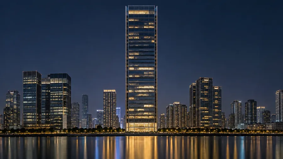
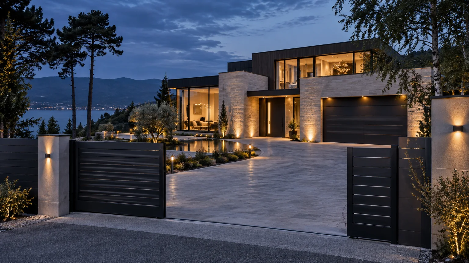
Façade · a tower at dawnConcept visualisation 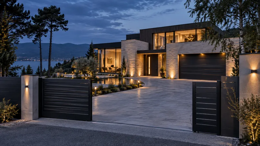
Intelligent systems · a home at duskConcept visualisation 
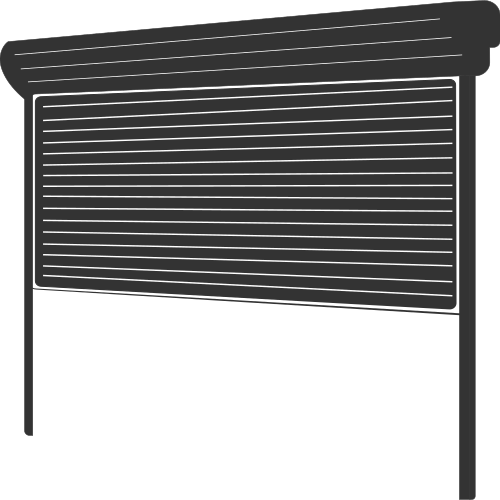
Garage doors · a garage at nightConcept visualisation 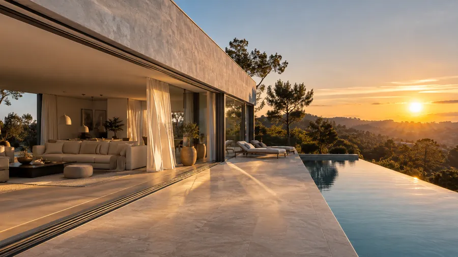
Windows & patio doors · a terrace at sunsetConcept visualisation 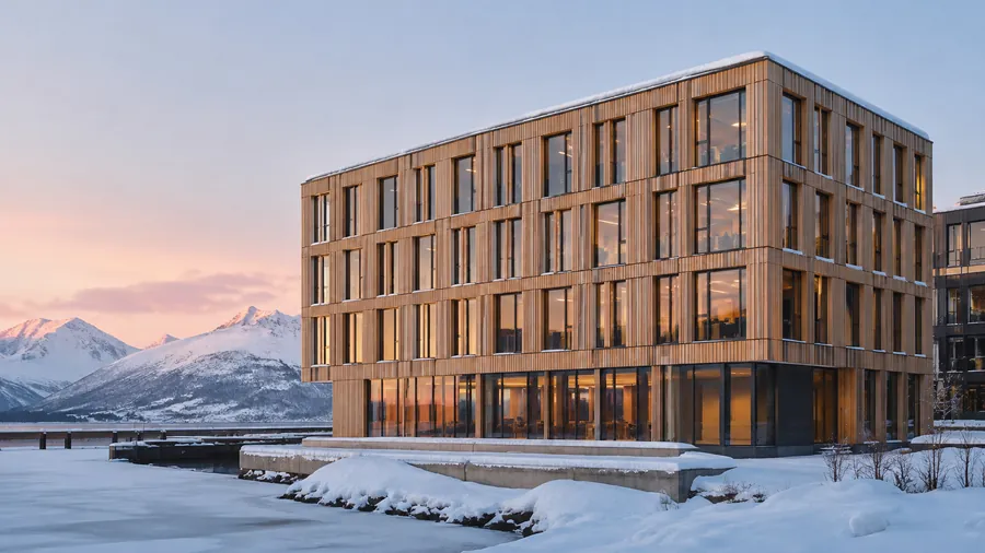
Façade · timber in a Nordic winterConcept visualisation 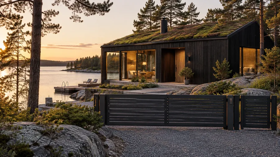
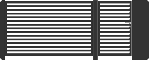
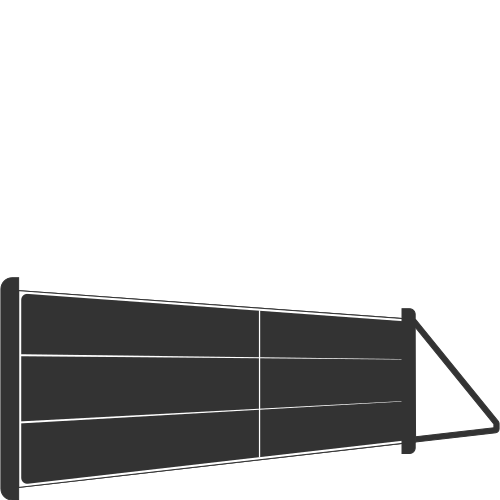
Fencing & gates · a house by the waterConcept visualisation 
Installation · working at heightConcept visualisation 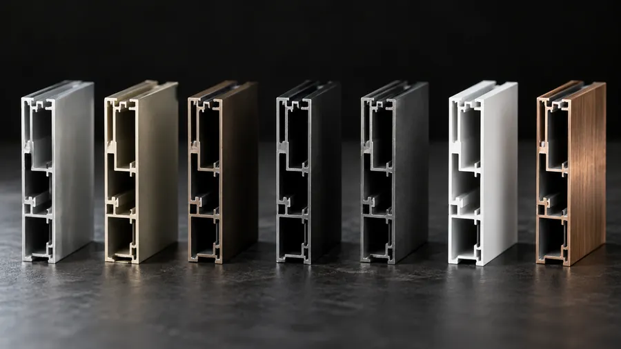
Materials · profiles and finishesConcept visualisation
No pictures chosen yet. Review your request
06Words
Write it the way we do.
Two words, both capitalised, with a trademark sign the first time. Copy what you need below, then let the style check read your draft.
Watford, with a capital W.
Construction, singular, with a capital C. Never Constructions.
™ on the first mention, then plain Watford Construction.
Not WC, and not in capitals in running text: the capitals belong to the logo. The full legal name, Watford Construction Limited, is for legal documents.
Boilerplates
Watford Construction™ is a construction company based in the United Kingdom. It brings domestic and commercial structures to 22 markets across Europe, North America, the Middle East and Asia-Pacific.
Watford Construction™ is a premier, global construction company that is at its best bringing domestic and commercial structures across Europe, North America, Asia-Pacific and the Middle East. Its products and services meet high quality European standards. From its head office in the United Kingdom, the company serves 22 markets in four regions across eight product families: buildings and garages, entrance and garage doors, fencing and gates, pods, windows and blinds, façades, intelligent systems and Home Inclusive™.
Watford Construction™ is a premier, global construction company that is at its best bringing domestic and commercial structures across Europe, North America, Asia-Pacific and the Middle East. Its products and services meet high quality European standards. From its head office in the United Kingdom, the company serves 22 markets in four regions.
Its work spans eight product families: buildings and garages, entrance and garage doors, fencing and gates, pods, windows and blinds, façades, intelligent systems and Home Inclusive™. Its aluminium and steel façade systems for towers, headquarters, hotels and homes are engineered in Europe, and designed, engineered, tested and installed as one system. Home Inclusive™ brings doors, windows, the garage and fencing together as one exterior, and Intelligent Systems brings the gate, the garage door, the entrance door, the windows, the blinds and the heating into one app.
The company’s guiding line is simple: people come first, in everything it does.
70 words
Fact file
- Name
- Watford Construction™
- Legal name
- Watford Construction Limited
- Head office
- Watford, United Kingdom
- Markets
- 22, in four regions
- Regions
- Europe · North America · Middle East · Asia-Pacific
- Product families
- Eight
- Website
- watford-construction.com
- Press desk
- enquiries@watford-construction.com
Registration details are on Company Information.
Names to get right
Product families
- Buildings & garages
- Entrance & garage doors
- Fencing & gates
- Pods
- Windows & blinds
- Façades
- Intelligent systems
- Home Inclusive™
Product pages and their lines
- Garage Doors · Open to more.
- Fences · Draw the line.
- Windows & Patio Doors · Let the light in.
- Façade · Make an impression.
- Intelligent Systems · Quietly intelligent.
- Home Inclusive · A world of your own.
- Hässleholm · The Garage Experience
Characters that matter
Façade, with a cedilla
Hässleholm, with an umlaut
Home Inclusive™, first mention
Windows & Patio Doors, as named
Check a draft
Paste a paragraph that mentions us. The check runs in your browser: nothing is sent or saved.
Waiting for a draft.
What it looks for
- Our name, written in full, with ™ the first time
- Product names, including Façade, Hässleholm and Home Inclusive
- British spelling, such as colour, aluminium and centre
- Claims and figures to check with the press desk before you publish
07With partners
Side by side, with room to spare.
Project boards, partner pages, event signs and shared announcements: when our name sits next to yours, give each logo its own space, and ask us before anything goes out.
Layout preview. Your own logo file goes where your name is.
Equal standing
Match the two logos by eye, so neither one dominates.
Space between
At least 2x between the logos, or x on each side of a hairline.
Black or white
Our logo stays black or white, whatever colours yours uses.
Never merged
Don’t overlap, combine or redraw the two logos into one.
Ask first
Send the layout and where it will appear before it is published.
How approval works
Send us the layout, with where and when it will appear.
We check our name, logo, pictures and anything said about our products.
We reply in writing: approved, or the changes we need.
You publish, and send us the link.
08Press desk
Talk to the press desk.
Tell us who you write for, what you need and by when. We lay it out as an email for you to send. Nothing leaves this page until you send it yourself.
Ready to send
Your request, prepared.
To: enquiries@watford-construction.com. Nothing has been sent yet. If your email app does not open, copy the email and send it to this address.
Questions from the press.
Please ask first. Choose what you need in the picture library and send the request: we will tell you which pictures you may use and send suitable files. Our pictures are concept visualisations, so please caption them that way.
Yes, as they are published on the page, together with the notes that explain them. Prices, specifications and availability can change, so check anything time-sensitive with the press desk before you publish.
Ask the press desk. Send your questions and your deadline, and we aim to come back to you before it, with a written statement or someone to talk to.
Please contact us before arranging a visit. Filming and photography need our agreement in advance, and on a building site everyone follows the site’s safety rules.
Ask us first with an approval request. We check the layout and what it says about the work, and reply in writing.
In the Newsroom. Its stories are dated to the month and link to the pages they describe.
Watford Construction™ · Press & brand · Pictures on this page are concept visualisations.
